
2022 Trends
Colour influences - autumn / winter 2022 trends
In association with

Now that the longer nights are drawing in, it's time to take a look at the must-have palettes for this autumn / winter season. We've teamed up with Crown Paints to bring you the key hues for the end of 2022.
Altered
Altered is all about liberation: freeing ourselves from rules, tradition and order. A key influence for this trend was Postmodern architecture; a style that first emerged in the 1960s as a reaction against austerity and formality.
Postmodern was a backlash against the Modern style of architecture which was utopian in style, lacked variety and had no relation to the architectural history of a place or space.
The work of the American Architect Michael Graves was instrumental to this trend. Michael was one of the New York Five; an American Postmodernist Architect who, following his own partial paralysis became an internationally recognised advocate of health care design. His design for Coletta School of Greater Washington was created for students with Autism and other difficulties.
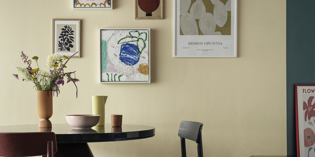
We wanted to capture freedom of expression, the unconventional and breaking boundaries. Paint and colour are shown in unexpected places. We’ve purposely chosen to break free of room geometry and place the focus on areas that are ordinarily ignored or an afterthought.
Ceramic Kiln works well on the ceiling of this dining area to create an intimate and cocooning feel, whilst the band of Botany Bay provides a sense of dynamism.
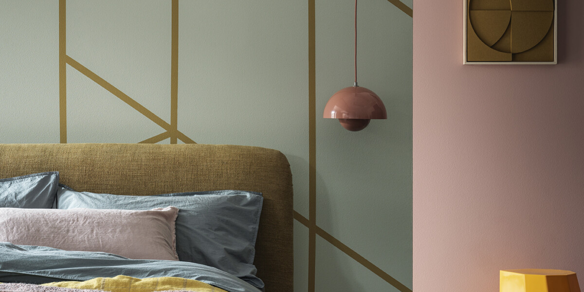
In the cameo bedroom shot, contemporary pastels dominate with pops of punchy hues.
Throughout both images, there’s an injection of grown-up fun with expressive artwork and artistic creativity through props and background colour. We wanted to mimic a gallery wall and the dining scene is filled with art, and includes youthful propping that has a sculptural element.
On the main image, Ceramic Kiln and Botany bay are tonally very similar but, sitting on opposites sides of the colour wheel, they provide the perfect contrast to excite and create a sense of expression.
On the cameo shot of the bedroom, the muted pastel shade of Poetry contrasts perfectly with Powdered Clay to provide quiet balance.
Conscious
Conscious looks at the work of trailblazing innovators who all work within the field of bio-material development. This trend focuses on stunning, sustainable products and materials.
One of the key designers on our radar were Ottan studio; an impact startup focused on up-cycling green waste into high-quality materials to be used in interior design and industrial design products. Ottan Studio sees the beauty in the pieces of nature people call waste. From seed to tree, from tree to life… its aim is to show that anything can be created from nature without consuming it. Ottan use fruit peels, grains, and garden waste to create their natural materials before mixing them with green resins to create numerous multipurpose products.
Upcycling, recycling and repurposing has been around for years but what we’re seeing now is a generation of designers creating sought-after and much-needed products and materials out of natural waste.
Every day, we’re consciously thinking of the lifecycle of everything we use; from the energy we use to heat our homes to what we buy to decorate our homes. Every purchase is carefully considered. We’re seeing designers create items that are beautifully useful, constructed from some unusual bi-products including wine, hemp, coffee, tobacco, garlic and even vodka!

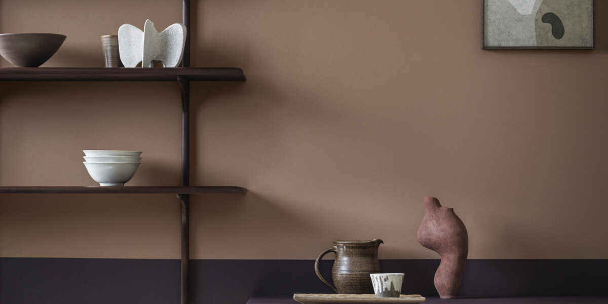
Soft, grown up nudes are key to this trend and, bar one, all of these are from the warm side of the colour wheel. This creates a palette that is calming, grounding and offers a sense of stability.
Photography heroes two of our new colours: Country Farmhouse & Saddle stitch.
Country Farmhouse (X2140S) is a rich warm neutral with red & brown undertones. Forecasted to be a hero colour for 2022 and beyond, we think of this as being a restorative and intimate shade.
Saddle Stitch (Z6241M) is a deep tan. A colour we’ve seen on the catwalks of spring / summer and autumn / winter 2022 trends, we believe this shade will transfer well to interiors.
Define
In the home, we know trends move slower than on the catwalk. Design for the home is all about making things so they can be adapted; constructing buildings with some non-structural internal walls which can come down as and when needed. With rental on the rise, furniture will be modular - unfitted kitchen units, well suited to rental spaces, will increase in popularity as people are able to take them with them when they move.
With the cost of living continually on the rise, a steady rise in fuel prices and a desire to have a positive change on our environment, working from home is the new normal for many. What is an office during the day needs to transform easily back into a family environment in the evening.
Spaces have become transitional and Define is our nod to this societal shift.
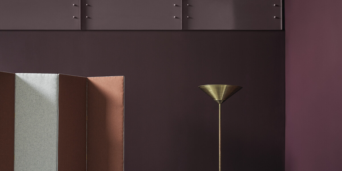
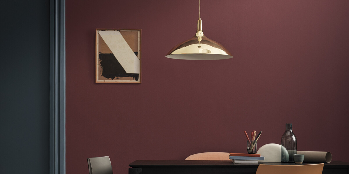
We aimed to show how a space could transition from day to evening with careful use of colour and accent lighting. Deep, sumptuous tones work to create spaces that are perfect for concentration and quiet reflection during the day but which transform a room into one which is ideal for entertaining during the evening.
Share
Topics
2022 TrendsYou might also like
-

Colour influences – spring / summer 2022 trends
-

How to overcome ‘white box syndrome’ after moving into a new build home
-

From exchange to EPC rating: We explain the most confusing house buying terminology
-

Showhome Spotlight: The Thespian at Oakfields Park, Halstead
-

Balcony styling ideas from interior designers to get you excited for summer
